GridSplitter
Based on UIView
Description
Allows for resizing of columns and rows in the Grid view.
Examples
Grid with resizable rows and columns:
<Grid Rows="100[50],*,100" Columns="100[20-150],*,100">
  <!-- content removed for brevity --->
 <GridSplitter Thickness="5" InteractionThickness="20"
               SplitterColor="#333333" SetSizeOnDragEnded="False" />
</Grid>
To create a resizable Grid add a GridSplitter to the grid. The gridsplitter creates interactable handles that can be used to resize the grid. The min/max size of columns/rows are specified as well, e.g. the first row 100[50] has a minimum size of 50 pixels, and the first column 100[20-150] has a minimum size of 20 pixels and a maximum size of 150 pixels.
You can also use control which rows/columns should be split, the extent of the splitter handle and use multiple grid-splitters if you want to split columns and rows differently.
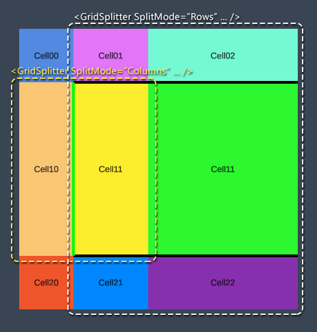
<GridSplitter Thickness="5" SplitMode="Rows"
              Grid.Cell="0,1"
              SplitterColor="Black"/>
<GridSplitter Thickness="5" SplitMode="Columns"
              Grid.Cell="1,0" Grid.CellSpan="1,2"
              SplitterColor="Green"/>
The first gridsplitter takes the area starting from the begining of first row, second column (0,1) and spans the rest of the grid, and splits all rows within. The second splitter takes the area r handle starts from the second column. The second gridsplitter splits the first two columns but the handle only extends one row.
Dependency Properties
| Name | Type | Description |
|---|---|---|
| Alignment | ElementAlignment | Used to align the view relative to the layout parent region it resides in. |
| Alpha | float | Can be used to adjust the alpha color of this view and all its children. E.g. used for fade in/out animations. Is separate from and different from the background color of the view as it affects the children as well. |
| BePushy | bool | Boolean indicating if resizing one column/row beyond min/max should push into and resize subsequent rows/columns. |
| BubbleNotifyChildLayoutChanged | bool | Boolean indicating if parent always should be notified when the child changes layout. |
| DisableLayoutUpdate | bool | Boolean indicating if automatic layout updates for this view should be disabled. When disabled the view doesn’t call UpdateLayout() when properties such as Width, Height, etc. changes. |
| EnableScriptEvents | bool | Boolean indicating if unity script events (Update, LateUpdate, Awake, etc) should be relayed to the view code-behind through the corresponding methods that can be overriden. |
| GameObject | GameObject | GameObject in the hierarchy that corresponds to the view. |
| Height | ElementSize | The height of the view in pixels or percents. |
| IgnoreFlip | bool | Used when doing localization override default behavior of flipping the view Right to Left or Left to Rigth. |
| IgnoreObject | bool | Boolean indicating if the view should be ignored. Ignored objects don’t run any load logic and don’t respond to property changed events. |
| InteractionThickness | ElementSize | Indicates how thick the interactable region of the splitter handle is. Can be larger than the actual thickness to make it easer for the user to interact with the handle. |
| IsActive | bool | Boolean indicating if the view is active. Deactivated views deactivates corresponding game object, components, renderers and scripts. |
| IsVisible | bool | Boolean indicating if view is visible or hidden. Invisible views still take up space but aren’t interactable and have their alpha set to 0. |
| LoadMode | LoadMode | Enum flags indicating when and how the view should be loaded by the framework. Can be changed when e.g. the view is to be loaded on-demand. |
| Margin | ElementMargin | Adding margins to a view changes the size of the area in which its content resides, but it does not change the width or height of the view. |
| Offset | ElementMargin | Determines the offset of the view. |
| OffsetFromParent | ElementMargin | Offset set by a parent view. Used by views like Group to arrange children without changing their own Offset values. |
| OverrideHeight | ElementSize | Overrides regular Height value. Used to e.g. automatically size items without changing the default Height value set. |
| OverrideProportionalSize | bool | Boolean indicating if the proportional size of the columns/rows should be overriden when resizing, and set to absolute (pixel) sizes instead. |
| OverrideWidth | ElementSize | Overrides regular Width value. Used to e.g. automatically size items without changing the default Width value set. |
| Pivot | Vector2 | The pivot point of the view. |
| Position | Vector3 | Directly sets the local position of the view relative to parent. Position otherwise set using the Alignment and Offset properties. |
| RaycastBlockMode | RaycastBlockMode | Enum indicating if raycasts should be blocked. |
| Rotation | Quaternion | Rotation of the view. |
| Scale | Vector3 | Scale of the view. |
| SetSizeOnDragEnded | bool | Boolean indicating if the size of the row/column should be set after the user releases the handle. |
| SplitMode | SplitMode | Sets if the grid should be split by columns, rows or both. |
| SplitterColor | Color | Color used by the grid splitter handles. |
| Thickness | ElementSize | The thickness of the grid splitter handles. |
| UseFastShader | bool | Boolean indicating if the default UI shader should be replaced by a simpler and faster one. The faster shader does not support masking and clipping. |
| Width | ElementSize | The width of the view in pixels or percents. |